Creating the Perfect Interface between "Man and Product"
Interview with Achim Pohl - Designer, Co-Founder and CEO of ARTEFAKT Design


Making a product to the extreme is the common spirit of many great designers. In this year’s iF DESIGN AWARD winners list, there is a design company that has been hitting the ground running with a common product in our daily life – 5 of the 6 iF DESIGN AWARDS are toilet actuation plates, among which Visign for More 202 won an iF DESIGN AWARD Gold this year. The creative force behind this minimalist gold award-winning work is ARTEFAKT Design from Germany.
ARTEFAKT Design, founded in 1989 by Achim Pohl and Tomas Fiegl, at first focused on architecture design. In 2006, based on the two founders’ personal interest, it established CYCLING (bicycle product design) as another area of focus for the company. Dedicating itself to two different design segments, ARCHITECTURE and CYCLING, allows the team the greatest possible diversification and opportunity for innovation through a “cross-knowledge creation process.” ARTEFAKT Design, now with a creative team of 15 members in its studio in Darmstadt, provides full service ranging from product strategy and development to market- ready products. Its clients include Alape, Hansa, Hewi, Jado, Kermi, Rehau, Richter+Frenzel, Siemens, Viega, Bosch, Brose, Canyon, RTI Sports and Scott, to name just a few.
The company name, “ARTEFAKT”, is a compound word derived from the Latin words ars (art) and factum (making). It stands for the interface between “man and machine” that reflects the essential core themes of its work. ARTEFAKT Design believes that industrial designers should design products that not only meet the user’s emotional and functional requirements but also consider the society and sustainable development. For both the ARCHITECTURE and CYCLING divisions, the “internet of things” will generate a completely new generation of traditional products: the basic functionality will remain the same, but the “human-product” interface will give the products a completely new appearance. This again shows the great role that the UX/UI division “user experience / user interface” will play in the future for the product designer. As for identity of brands and products, ARTEFAKT Design believes in reduction and concentration on the essential components with everything not necessary left out.
Over the years, the works of ARTEFAKT Design have achieved great market success and won over 250 awards, about 10% of which were “Best of Mentions,” and this achievement could be viewed as a confirmation of its philosophy and contemporary way of working. For this issue, Package & Design conducted an exclusive interview with Achim Pohl, Co-Founder and CEO of ARTEFAKT Design, and selected some exceptional design works of ARTEFAKT Design.

DOMOVARI SCALA | Ceramic and furniture series
SCALA is a wide-ranged washstand system made of mineral cast. The innovative integrated siphon allows new design solutions from large washbasin units to small guest bathrooms.

IDEAL STANDARD TONIC II | Total bathroom
TONIC II includes a full range of ceramics and furniture, plus bath tubs and fittings, and is therefore a complete solution for the bathroom. the central design feature of the ceramic is the "soft edge" contour, as well as the floating shape of the basin through. This contour is reflected both in the shape of the outer form and the flush overflow made of ceramic. The handle/towel rail and the open space are both integrated in a formal and functional way to the soft geometric design concept.
Interview with
Achim Pohl
Published by courtesy of Package & Design Magazine
First of all, congratulations on ARTEFAKT Design’s 6 works’ winning the iF DESIGN AWARD this year. 5 of the 6 award-winning works are actuation plates, among which the Visign for More 202 won an iF DESIGN AWARD Gold. How long did it take to develop this gold award-winning product? Please talk about its design concept and innovation.

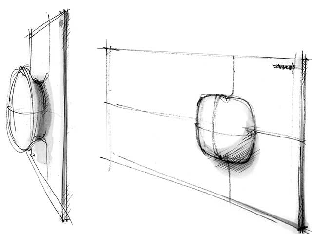
VIEGA PREVISTA VISIGN FOR MORE 202 | flush plate, iF gold award 2020
It is the sculptural aspect of the VISIGN FOR MORE 202 toilet actuation plate that determines its design identity. The smooth transition between plate and control element, as well as the indirect lighting, gently draw the user's attention to the center of the device by day and night. Thanks to the use of a novel operating technology, the operation becomes an experience, and the smallest rotational movement to right or left suffices to activate the flush. These actuation plates fit equally well in minimalistic and organic bathroom interiors.

It was not the first time ARTEFAKT designed actuation plates for VIEGA. Could you talk about the collaboration between ARTEFAKT Design and VIEGA? During the development process, did ARTEFAKT Design have a high degree of freedom in creation? Or did VIEGA stay highly engaged?
AP: The basis of the surprising huge success during the previous years is the perfection of team play between VIEGA and ARTEFAKT. It’s an eye-level collaboration. Marketing, engineering and design are respecting the high quality level among each other. ARTEFAKT design bears responsibility for the interface between man and product (“building and product”). That means, ARTEFAKT ensures that the technical requirements of the company are used optimally. The user receives the product that is perfectly tailored to him emotionally, functionally and in terms of price. In order to achieve this goal, we are given the highest degree of trust and freedom of decision. Of course this does not only apply to actuation plates, but also to the whole range of products like water inlet or outlet systems or electronic devices and UX design. We carefully coordinate the design of the whole programm piece by piece, developing a CI, so to speak. Even the technical components under the wall or behind the bathtub are optimized by us in terms of design and differentiated within the framework of a colour concept. This enables the craftsman to better distinguish the relevant components during installation and maintenance.

VIEGA MULTIPLEX TRIO E3
Electronic bath & shower mixer: TRIO E3 is advancing the trend of electronic intelligence, combining the bathtub flow and drainage functions into one integrated system. Precise setting of water quantity and temperature saves natural resources, energy and is also pure comfort. It can be operated easily by the rotatable scroll-display.
ARTEFAKT Design has done a lot of design for this kind of product. So why design separately a less prominent part like the actuation plate instead of designing it together with the toilet? Please talk about ARTEFAKT’s design experience with such products. What do you think are the design trends in this field? What are the biggest challenges in the design and innovation process?
AP: This is a good point, and we will certainly surprise the market in the near future. Especially in the times of “COVID-19,” a large market will emerge here and there is a considerable backlog demand. For this reason, with VIEGA we have been focusing on electronic networking, touch-free and remote-controllable products from a very early stage. We make intensive use of this know-how in our latest product developments. In the ARCHITECTURE area in particular, we also bring our customers together to develop and implement new solutions. Whereas up to now, it was primarily solitary fitting lines that were “state of the art,” the “internet of things” in particular will now bring the final breakthrough of electronics in the bathroom. The communication of the products with each other, their perfect adaptation to individual users and user groups and building requirements will enable considerable added value in terms of sustainable comfort. App, smartphone, voice and gestures bring individual everyday life and living together. For us designers, this is an exciting development and technology. It places completely new demands on the design. It allows the maximum integration of technology and thus a big step towards optimal hygiene. “User interface” is becoming an increasing part of product identity and a new challenge for the profession of designer. A new and very exciting chapter of product design that gives us a lot of joy and where we can learn a lot.

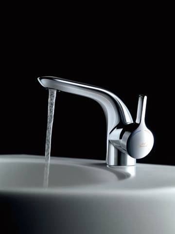
IDEAL STANDARD MELANGE | Fitting series
Based on the sensuality of the natural flow of the water, MELANGE combines flowing shapes with ultra soft surfaces to make a new sleek elegance. The innovative technology is a self-evident part of the whole and focuses on the emotional aspects. High quality and highly resistant surfaces lend MELANGE its unique charm within a modern and sensuous lifestyle.

JADO JOY | Fitting series
Organic floating intersections combine well known basic elements to a harmonic sculptural unity. An absolutely new and patented lifting technology offers an intuitive handling.

JADO EVOLUTION | Electronic fitting series
EVOLUTION has been deliberately designed as part of the system and represents a new era of digital networking in the bathroom. Trusted creative and functional elements are an integral part of global electronic communication and therefore allow for intuitive access for the user. The touch display replaces the cleaning intensive mechanical construction elements and allows a functional user interface. EVOLUTION starts only when touched and offers the user individual presetting including temperature, amount, volume and time.
In terms of cycling products and architectural products, does ARTEFAKT Design have different design processes? Please talk about the typical development and design process of ARTEFAKT Design regarding the two types of products. Would the entire design process carry through under a comprehensive brand framework?
AP: We always see our products only as a part of the whole, of a product environment. So we always start with the definition of the people who will use the product. We put ourselves into their individual living environment, emotional and functional requirements which connect them with the product. Are the products used by one person or a group of people? Only from this can the product requirements and product strategy be determined. In a second step, we always analyse the current trends in the market regarding design, technology and functionality and define their future significance for our product. In the area of CYCLING, we are talking about an extremely technology-heavy product. The disruptive development of e-mobility, for example, constantly places completely new demands on the products. In this area, we develop in many small steps and in the context of workshops, intensively together with the engineers in order to unite the design and technical goals again and again. An extremely homogeneous development process which requires unbelievable confidence in the abilities of the development partner. In the field of ARCHITECTURE, on the other hand, our products always become part of a design environment. They have to be fully functional and, above all, emotionally complementary in terms of design. This means there are only “2 development steps” to determine the appropriate design. In every case we then accompany our customers through the design phase up to the market launch, organize design price applications and patent applications. It is an incredibly extensive process until a product can successfully conquer the market.
ARTEFAKT Design creates identity for brands and products through both reduction and concentration on the essential components. Can we understand it as the concept of “Minimalist Design”? Please elaborate on the design philosophy of ARTEFAKT Design. How do you define ARTEFAKT’s design style?
AP: The question is – what does identity mean? Identity means to have a recognizable personality, not to be a nobody. In this respect, it is necessary to sharpen or focus the existing identity of a company, or to describe a targeted identity and to work out all attributes connected with it, and to put them in the foreground. Everything that is not necessary for this or even contradicts this goal should be left out. No innovation for the sake of innovation and no being different for the sake of being different. We at ARTEFAKT call this – REDUCE to IDENTITY – if you understand this as minimalism, yes, it’s our handwriting or the ARTEFAKT typical style that describes our quality. But it has nothing to do with geometrical or organic and nothing to do with rational or emotional. It’s simply the reduction to the essential and the creation of an identity. This is our philosophy to design and generate products that perfectly complement different living environments.

JATEC BIONIC | Door handle
Two cylindrical arms are organically combined and therefore define the swivelling axis and gripping element from BIONIC.

KATANA E-LOCK | Hotel door locking system
With the eLOCK system – including the eREADER at the outdoor station and eLOCK at the door of the hotel room – you have keyless access to the hotel, arranging check-in and check-out, as well as booking and payment in one app. A light signal in the display status and illuminated icons enable intuitive and internationally understandable handling.

KERMI SIGNO | Heated towel rail
KERMI SIGNO is a modularly structured heated towel rail. Thanks to the addition of individual heated surface modules, different configurations can be produced. With the quadratic modules, novel heated towel rails are thus created in a two-dimensional look-and-feel for integration into a modern bathroom architecture. There is space for up to three individual surface modules in the supply section.
How do you see the future trend for cycling design?
AP: The key word e-mobility describes the dominant trend in this area and has completely shifted the focus of work across all bicycle segments. In addition to sports equipment, the topic of “Transportation” has moved into the center of attention. The gap between car and bicycle is increasingly closing. Functional mobility from A. to B. is becoming the core topic. CARGO or URBAN bikes transport big and small things around the family and work and bring them comfortably to work and back. Even in the professional sector we develop last mile transport options for parcel services. Besides the bicycle manufacturers, this is also a huge future market for companies like our customer BOSCH. Here, the planning of the digital future around drive and safety technology is in full swing. Here we have the opportunity to design products for an emission-free and sustainable future.

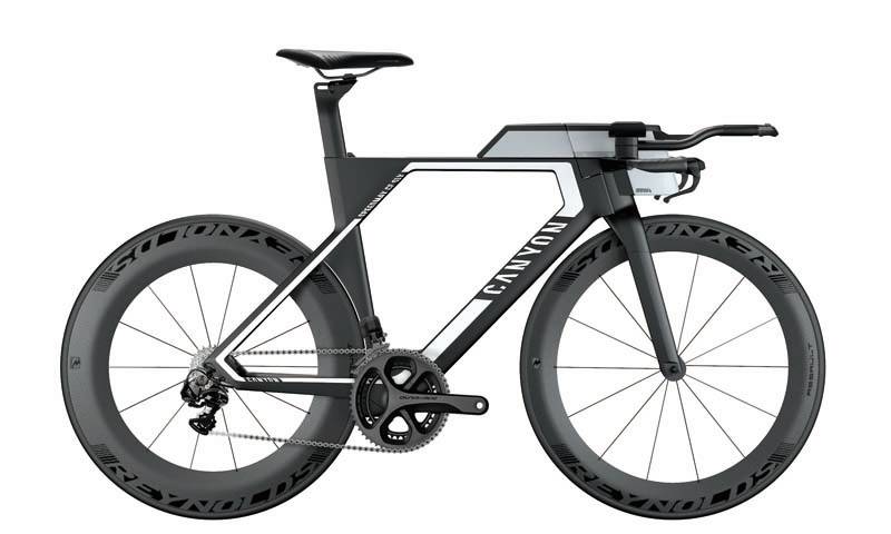
CANYON SPEEDMAX CF SLX | Triathlon bike
“System complete” is the production concept of the triathlon version of the time trial bicycle. Through the optional enabling of the drinking system and the storage box, the racer is suitable for long-distance routes and becomes more efficient in its aerodynamic features.

KLEVER MODEL X | E-bike
Urban e-bike with BIACTRON rear engine and aluminium frame. The unisex “loop frame” Includes the battery unit and is a modular frame platform for different bike types, from single speed to comuter bike, with full range of equipment complying with german national road regulations in pedelec and s-pedelec specification.

KETTLER CARGOLINE | E-cargo bike range
The range of cargo bikes includes hardtail and fully frames with an eye-catching horizontal alignment and a variety of assemblies for private and commercial usage. The bikes have a dedicated steering hub with an integrated suspension as well as a BOSCH drive unit, which runs with 1.250 wh battery power.
You have been a judge for many international design awards. As for you, what’s the significance of participating and winning an award? Do you have an internal criterion for selecting works for entries?
AP: Yes, that’s right. I was also part of the jury for the “iF DESIGN TALENT AWARD 2020.” The topic was the sustainable use of our resources. It was incredibly exciting to judge the entries of young designers from all over the world. Fantastic solutions on the topic of water shortage or sanitary hygiene in problem regions give you hope for a better future. Respect for these young designers. My selection criteria for the yes or no assessment are based on my design philosophy: if the product has a focus, an identity, if it is free of unnecessary ballast or superficial features, if this is also clearly worked out in a creative way and looks up-to-date, then it is worth an award for me. Exactly this is also the basis for respecting cultural differences, different income level and individual requests – not just making one’s own focus the yardstick. Exactly these are the criteria we are measured by. More than 250 awards and about 10% of them “Best of Mentions” confirm our way of thinking. In any case, it is always a thrilling moment to win an award and a great confirmation for our clients and of course for us designers.
(Source: Package & Design, 2020, May Issue, p. 50-63)


